 (26
of votes., on average: 4,77
of 5)
(26
of votes., on average: 4,77
of 5)
Apartment design
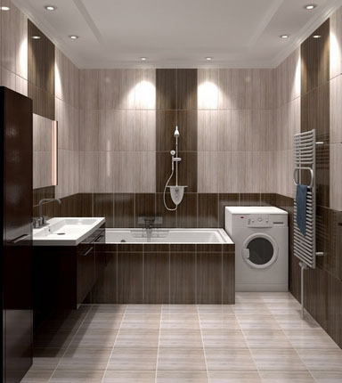
The variety of tiles for wall structures is very wide, there are a lot of colors, textures and dimensions. Tiles that have a square shape and averaged dimensions are quite multifunctional - it fits perfectly, both in spacious and in small bathrooms regardless of their design.
However, at the moment the rectangular shape of the facing tile is more popular - with its application, fewer "seams" and a greater variety of patterns are formed. Since a rectangular tile can be arranged both vertically and horizontally, it is also possible to combine a variant (a vertical layout is combined with a horizontal one). Which method is preferable?
Vertical and horizontal tile laying
Can the method of layout affect the design of the bathroom? Yes, but only if the intermediate seams stand out against the background of the tile or alternate tiles of different shades. For example, if the tile is black and the trowel is white, the direction of the layout becomes obvious and to some extent affects the visual perception of the room.
In the case where the seams are barely discernible, there is virtually no difference in the vertical and horizontal layout.
how to lay the tile horizontally or vertically
No impact, produces a large tile close to a square with a minimum difference in width from the length. With different ways of laying out a similar tile, it will look approximately the same.

How does the tiling method work on the interior?
Vertical layout of tiles with contrasting seams visually makes the room higher, at the same time narrowing it. The horizontal, on the contrary, expands the bathroom, making it lower.
To support the effect, often add to the scheme of decoration accent inserts from tiles or other decor. For example, make one or more horizontal rows for visual expansion of the bathroom. To make a ceiling above vertical inserts can.
![]()
In addition, the strip allows you to smooth the effect of the layout of the tiles. For example, if the preference is given to the vertical direction, several horizontal bands need to be contrasted. As a result, the vertical layout of the tile will narrow the room, but the horizontal insert softens the effect. At the same time, the bathroom will not become narrow or low.
This rule also works with the reverse scheme: the tile is laid horizontally, but one or a pair of vertical inserts is added. As a result, you get an increase in the perimeter, both vertically and horizontally.
Visually increase the bathroom combined layout of the tile similar to the panel (white top - black bottom or back). With this finish, the way the tiles are positioned will not have a strong effect.

Choose: vertical or horizontal tile laying?
Horizontal tile laying is more familiar to the eye, because it looks more natural. Since the standard horizontal brickwork is familiar. However, if a grout is not used, then attention is not drawn to the location of the tile.
The horizontal location of the rectangular tile may allow the use of a standard brick layout with offset seams. This will bring a highlight to the interior.
 horizontal or vertical tile laying
If the room is quite small, and the tile is sufficiently elongated, the horizontal styling will look unimportant due to the large number of "pieces". It is better to arrange it vertically and apply a grout that fuses with the tile.
The narrowest fragments fit only horizontally.


To finish the screen under the very design of the bathtub, it is better to choose a tile of such dimensions so that it does not need to be trimmed in height. Here the method of laying is subordinate to the rule of practicality, and not the visual component.
Have you ever wondered which version of stacking would be better: vertical or horizontal? It is believed that vertical stripes add height to the room, and horizontal - it extends it. In this article, we will try to figure out, by examples, which tile design in the bathroom will look best.
Quick navigation for article
Introductory information
For the experiment, take a 3D model of a square bathroom with a combined bathroom, its dimensions will be 2.4 * 2.4 meters. Ceiling height is 2.5 meters. The photo shows a view from the door.
As an example, the lining is made with Cerdisa Italian tiles, the Perlage collection. The wall tiles measure 20 * 50 cm, and the floor tile - 33 * 33 cm. The layout is made taking into account the seams of 1.5 mm.
Compare design options
Vertical and horizontal laying
The first example shows the difference between the vertical and horizontal laying of tiles of the same color. Does it seem that on the left photo the bathroom becomes higher, and on the second - wider? Perhaps there is a difference, but insignificant.
Change the color of the tiles to white. The difference between the two photos became more pronounced, due to the fact that seams were now visible. They are perceived by us as guides, and divert attention to ourselves, as a result of which there is a feeling of stretching the room in height or length. The more contrasting seams there are, the stronger this effect will increase.
Try to achieve an increase in space by adding 3 horizontal rows of white tiles. This time the tile on the right picture clearly increases the width of the bathroom. At the same time, both options were laid out in a horizontal layout.
But most of all, the effect of this effect will be seen if we compare a vertical monochrome tile and a horizontal layout with a contrast guide. In this example, the advantage of the second option became obvious, especially when designing in a small bathroom. But besides this, you can see one more technique that helps to increase space - this is using a light color.
In practice, many tilers do not like the vertical layout, because when laying it is impossible to avoid narrow undercutting of less than ½ tiles. They are always conspicuous, look ugly and disrupt the effect of symmetry.
With a horizontal layout is easier - it can be removed and get rid of the narrow undercut. How best to do this has already been written. If it is short - it is necessary to count, how many whole tiles will climb on a wall and subtract one piece. Begin the stacking from the center and get at the edges 2 uniform cuts that will not be narrow.
Judging from the point of view of perception, people are more accustomed to seeing horizontal coloring than vertical. All vertical guides disappear after the bathroom furnishings.

Color selection
Everyone knows that light colors visually increase space, and dark ones on the contrary narrow. In the following example, you can clearly see the effect of this rule. To make this clearer, you can compare the black and white colors, but with the orange color it is clearly visible.
Now let's see what happens if we make a dark contrast guide horizontally. The positive effect of the horizontal guide and the negative of the use of a dark color will blend into the heap, and in the end you will not get any visible result.
Vertical inserts
With horizontal lines, everything is clear - they greatly help to enhance the bathroom interior, but is it possible to achieve a similar result when using vertical inserts from the decor?
The first example shows a very small effect of a visual increase in the height of the ceilings. First of all, this is due to the short length of the vertical insert in comparison with the long horizontal belt. But the effect is still there, and you can see it if you compare the vertical layout with the vertical insert and the usual horizontal layout.
On the right photo the bathroom seems higher. If you compare it with the top photo with orange horizontal and vertical layout, then the option with the insert of the decor adds height to the room. The strength of this effect depends on the contrast of the insert.
Change the color of one wall to white to highlight contrasting seams. In addition to visually increasing the height of the room, this reception has well distinguished the decor and attracted attention to it.
Now let's compare 2 white interiors - with a vertical guide and without it. As with the design of the orange bath, the right picture looks a little higher (the total length of the insert is small). But unlike the orange variant, due to the contrast of the seams the result is more evident.
To see this even harder, let's compare the horizontal layout and the vertical layout with the insert. The interior on the left looks stretched in width, and on the right - in height, although the actual dimensions remained the same.
And the last example is to place the decor horizontally on top. It attracts attention because of contrast, emphasizing the height of the room, due to which it seems visually higher.
Conclusion
There is no particular difference if you use only one of the methods described. As you can see, the usual change of layout from vertical to horizontal is not enough.
If you want to increase the interior width, additionally make a belt of light tiles along the perimeter of the bathroom, which will be torn only at the doorway.
If you want to raise the ceiling - place a vertical line of decor, or make a contrasting horizontal line at the top of the walls.
The most practical version of the design of tiles in the bathroom: from below and from above will go the stroke from a dark background, and in the center will go a light background. In this case, the upper stroke should be narrow (1-2 tiles), and the lower one should be at least 1/2 row above the bathroom. 
In order not to get too boring interior, all solid white background tiles are replaced with a decor or a dark background, except for a wall with a doorway. Practically - because it does not get narrow scraps over the bathroom, you do not need to trim the decor, the dirt is less visible in the darker color. At the same time, this combination will stretch the room well and will not ruin you for buying a large amount of decor.
Variants - the basis of interior design. Even a single-colored coating without a pattern can create unique visual images only due to the unusual geometry of the laying. Not to mention multi-color panels or decorative compositions, sometimes requiring a particularly careful approach to the choice of options for placing tiles in the rows. In any case, after reading this article, you will have ideas how to design a bathroom.
Bathroom with mixed tile layout
Which layout should I choose?
How to arrange the tile in the bathroom? Standard tile has a rectangular or square shape. Accordingly, most of the layout options and the location of the tiles in the bathroom assume a horizontal or vertical orientation of the coating. If it is a question of independent - it is necessary to give preference to the simpler, classic ways of laying - the vertical layout of tiles in the bathroom or horizontal examples of the layout of tiles in the bathroom. Give up complex options: the use of small elements, diagonal, fantasy layout.
Are you planning to apply chess variants of laying tiles in the bathroom or combine several shades in one coating? Choose not just the same size elements, but products of the same manufacturer. And even better - a tile from one collection. In this case, all the elements of the composition will ideally be combined among themselves and in texture, in size, and in color.

There are certain canons - ideal examples of laying tiles in the bathroom: with an indispensable curb in the middle of the wall, choosing a darker tile for the lower part of the wall and light for the top. In fact, this option is now applicable only for finishing bathrooms in public places. But for a house or apartment it is better to choose easier options for laying tiles in the bathroom, allowing to smooth out small dimensions of the bathroom space, visually increasing the height of the ceiling.
So, for smaller bathrooms, it is better to use a glossy tile of light tones.
And for rooms with low ceilings is contraindicated horizontal layout of tiles in the bathroom - it is better to choose vertically oriented options with an elongated pattern. Decorative elements and ornament in this case it is better to have at the level of human growth. And to expand the boundaries of space, you can use such design techniques as mirrors and glass partitions or doors of frosted glass in the interior of the apartment or house.

In the decoration of the bathroom it is important to pay attention not only to the formation of a general design concept for this room, but also to the combination of interior design of a house or apartment with a bathroom finish. Whatever the ways of laying the tiles in the bathroom, try to maintain a uniform color scheme.
We plan the layout of the tiles
Before you start creating options for laying tiles in the bathroom and thinking about how to place the tile in the bathroom, you need to make measurements and calculate the amount of material necessary for the work. This is done as follows:
- The measurements of the surfaces of walls, floor, all projections and technological holes are made. Based on the data obtained, a plan is drawn.
- On the plan, there are options for placing tiles in the bathroom floor, plumbing fixtures, heating batteries, lighting fixtures, sockets, ventilation holes, etc.
- On projects of laying tiles in the bathroom, the planned way of layout is transferred. If necessary, apply several options - to determine the best option.

Layout of tiles: options
There are many options for laying tiles. Consider the most popular samples of tile layout in the bathroom in more detail:
- Classical or direct - the tiles are laid in rows, one above the other with the seam aligned in the seam. Horizontal lines are laid out using a square, vertical tiling in the bathroom is carried out using a plumb line. Installation of tiles in this case is done with the help of plastic "crosses", allowing to ensure the creation of an even seam line.

- With the offset - the tiles are stacked by analogy with bricklaying, moving from row to row for an equal distance (usually half the width of the tile). These examples of tile laying in the bathroom mean only horizontal placement.
- Tile diagonally in the bathroom - in this case joints of seams are located on a diagonal, and the tile itself is cut with a cut of corners on the sides. The diagonal layout is complex in performance, but allows you to expand the boundaries of space, visually increase it.

- Chess layout - in this case, the arrangement of the decor in the bathroom is stacked by analogy with the cells of the chessboard. This option is convenient if the design uses two or more colors.
- Modular - using tiles, homogeneous in texture, but different in size.

- Line drawings - in this case a tile of two or more colors is used, laying is performed linearly, parallel, broken, interrupted or in a continuous manner.
Of course, only standard styling options are not necessarily limited. You can always choose the types of tile layout in the bathroom that suits you best, or you can think of how to arrange tiles in the bathroom with your own original way of combining tiles in color, size or texture. Types of tiling in the bathroom you can see in our photo. Perhaps, it is when viewing them that you will understand how to arrange the tile in the bathroom.
Most often, the interior of the bathroom is decorated with ceramic tiles. However, when the moment of its laying comes, the question arises, how to arrange the tile: horizontally or vertically. In fact, this issue only at first glance may seeminsignificant. But in practice, from how you arrange the tile will depend on at least the visual perception of the bathroom. So, the vertical tile makes the room elongated, visually increasing it in height, but the tile located horizontally expands the room.The company Santa-Keramika provided a bathroom project, within which an experiment will be conducted with the layout of the tiles.So, a square bathroom of a standard size (combined with a bathroom, a ceiling height of 250 cm and a size of 2.4x2.4).The Italian factory Cerdisa produces an excellent ceramic tile, actually in our experiment will be used tiles from the collection of Perlage. This is a rectangular tile with a size of 20x50 cm orange and white. And here on the floor is laid outsquare tiles 33n33 cm in size.
1) Vertical and horizontal laying of orange tiles.
So, on the left photo there is a bathroom with a vertically laid tile, it seems to you that visually this bathroom seems slightly higher than the one pictured on the right - the tile is laid out horizontally. However, these differences are not significant, so we will conduct the next experiment using white tiles.
2) Vertical and horizontal arrangement of white tiles.

The difference between these options is already more noticeable, it is especially evident how much wider the bathroom looks with white horizontal tiles. And it's all about the seams. On a white background, a more noticeable contrast is obtained, which means that the seams have become guides. Thus, in the bathroom with a vertical tile, the seams go to the height, and in the bathroom with the horizontal tile, they are spread out on the sides, i.e. in width. Thus, the stronger the contrast, the more obvious the visual effect.
3) Guides in contrast.

On the photo from the left is a bathroom with a horizontal orange tile without contrasting guides.But on the right photo the tile also remained vertical, but there was a contrast, which, undoubtedly, makes the room wider.
4) Horizontal contrast or vertical styling.

As you can see, there is a bathroom with a vertical tile on one photo, so the room seems stretched out. On the second photo there is a bathroom with horizontally laid tiles and a contrasting guide from white tiles. Undoubtedly, the right room is visually, it seems much larger. The stern of the contrasting guide to the extension worked and in itself a lighter color - a white tile on an orange background.
5) Bright increases the space.
Let's check this statement and compare the photos.

In practice, the bathrooms are the same, but in our experimental photos the white tile bathroom seems a bit more orange in color.
And now draw a horizontal guide from the orange tile in the white bathroom.
6) Contrast guides in dark colors.

So, in the bathroom with a horizontal white tile in the middle laid a guide from a dark color. What happened? If to compare with a bathroom from a white tile, it seems that the rooms are absolutely identical in size. This happens for the following reasons: white color and guides in fact increase the visual space, but the dark color on a white background visually narrows the space. So these mutually exclusive facts led to the identity of the experimental spaces.
7) Vertical tile and vertical guide.

In the photo there are two bathrooms with a vertical styling, but, the right bathroom is decorated with a curb, which is also located vertically and not in the center. Visually, it seems to us that such a room is a little higher. However, if you compare the result with a horizontal guide, the result is not so significant. And the fact is that the vertical curb occupies a smaller space in the bathroom.
8) Vertical stacking with the guide in comparison with the horizontal packing.

In comparison there is a bathroom with a horizontal styling and a bathroom with a vertical styling and a curb. Result:the bathroom on the right photo with the guide clearly looks higher. To strengthen this effect, the guide should be made even more contrast, for example, white.
9) Contrast enhancement.

So, the stronger the contrast, the greater the result. In this case, in one of the bathrooms there was a replacement of the tiles on one of the walls with a contrasting guide along the vertical. By increasing the contrast and adding white color, the bathroom on the right figure is unambiguous, it seems visually greater.
10) White tiles against a vertical border.

The bathrooms are minimal, you can say,that they are identical. Again, the advantage of white in the interior played into the hands.
11) Horizontal white tiles in comparison with vertical (guide).

Here the result is ambiguous, because Bathroom with horizontal tiles - wide, and with a vertical guide - high. So the result is on both pictures.
12) Border at the top of the bathroom.

By placing a border at the top of the bathroom we visuallyemphasize the height of the room. Actually the photo with experiment is proof of this.
Conclusion:
Vertical tiling makes the space higher, and horizontal laying makes the room wider. The same rule applies to ascertaining guides. To emphasize the height of the room in an even greater degree, the decor (curbs) should be placed in the upper part of the bathroom.
More about the tile and the bathroom: